Wednesday, November 14, 2012

ARCH1202- Final Project

Drawings


1:500 Site Model


3 main concepts


Axis pointing the two churches
St. Patrick's Church and the Breakthrough Church are significant along Church Street, as they are historical buildings in Parramatta. The two main pathways connecting Church Street and Marsden Street to the theatre, directing people to view the two churches. This creates an atmosphere that the theatres are part of Parramatta.

Introducing streetscape into the site
As the location of the site is less lively than  the southern side of the Parramatta. This creates a disconnection between the two sides of the river. Therefore, I tried to introduce the streetscape of Parramatta into the site by introducing shops and gallery along the two main pathways. Also, the pathway along the riverside connects with the existing pathway of the other side of Lennox Bridge, this brings people to the site and therefore again activating the site.
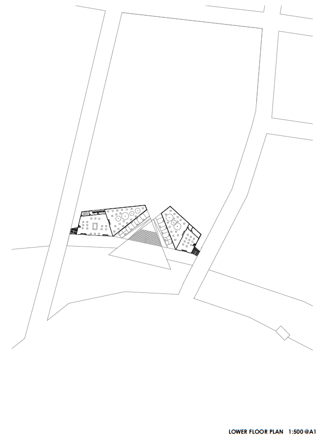
Circulation
Circulation pathways are all around the site, allowing people to access to the theatre from Church Street, Marsden Street, Victoria Road and the riverside,  integrating the site into Parramatta.  The two main pathway is of v-shape, this narrow people's view to a point in between the two theatres and then open up their view to the view of Parramatta.


Features of the theatre


Cafe and restaurant
The cafe and bar/restaurant are both located along the riverside, allowing people to enjoy the view of Parramatta River. The cafe is located in the western  side of the site, providing sufficient sufficient morning sun.  The restaurant/bar is located in the eastern side of the site, this directs it to the evening sun.

Large and small theatre
The two theatres are triangular in shape. They again point to the two churches, reminding people that they are in Parramatta.
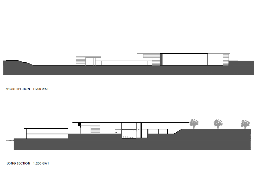
Glazing is used on both sides of the building, creating a sense of transparency and this merge the site with the surroundings. Also large eaves are installed in the building, this become a main shading device in the site.

Amphi theatre
The amphi theatre is located near the river and extended to the river, this creates a connection with the river, so that people can enjoy the performances as if they are on the river. It is also in triangular shape, echoing with that of the two indoor theatres.

Green area and water feature
The site is extended to Prince Alfred Park, the green area and water feature are relocated to integrate with the theatre design. The triangular green space in the middle responds to the shape of the three theatres . A public square with water features on both ends is created next to the green area, providing a place for leisure activities.


Design Process


Tuesday, August 28, 2012

ARCH1202 - Project 2

Swiss Sound Box
Peter Zumthor


-Designed for Expo 2000 in Hannover
- create a rest house where visitors can rest
- sounds, words, food and drink blend together

Main idea
- as if in the forest
- timber for construction
- timber stacks = the trees stand in regular density
- no large paths
- everyone has his/ her own path
- sunlight floods in through the gaps between stacks ( drive people to walk in)
- series of walls running parallel and perpendicular to each other
- gaps in the stacks allow people to see through the next space.
- bar areas and performing area are created by omitting some of the stack walls

Entrance
- open and permeable
- people can access from all sides of the building
- no established circulation

Basic Structure
- base on 4 stacks of stacked walls group together in a pin-wheel like formation
- divided into flank courts and cross court
- flank court: house the service units, located wherever the sides of 4 stacks met
- cross court: house the courtyards, located wherever the ends of 4 stacks meet


Nordic Countries Pavilion
Sverre Fehn


- locate in the only park in Venice
- the building is blend into the park (introducing open walls and preserve existing trees)
- no disconnection in the park

The pavilion
- opposite walls are open
- allows pre-existing circulation to continue through
- spaces are defined with a minimum of enclosed walls
- completely open, allows nature to become part of the exhibition space
- interior rooms are defined by existing trees more than by walls


Roof
- the girders run perpendicularly and set on top of each other
- block any sunlight from reaching the floor
- interruption in grid allows the existing tree to extend through the roof
- glass fibre gutters are stretched between the rows of girder


Friday, August 10, 2012

ARCH1202- Project 1

Posters


Historical evolution of Parramatta is shown through the four maps of different times (1804,1823,1844 and 2012). The green area of the city of Parramatta becomes smaller and smaller due to the development of the city. The density of the buildings increases and the building blocks become larger. The grid system of Parramatta expands and becomes more complex due to the development of the city through time. The highlighted areas are the historical buildings and landmarks that are remained till now. The history of Parramatta is revealed through the comparison of the historical maps.


Through cutting the sections along Church Street, the heights of the buildings are shown and hence the proportion of the pedestrians with the buildings can also be revealed. We can also see the varying widths of the street. Some parts of the pedestrian are widened in order to provide more space for outdoor catering, while some parts of the road are indented for vehicles to park.


Stage Design


In order to bring Parramatta into the West Side Story, we decided to introduce some features of Parramatta to the stage, namely the train station, St. Patrick Church, Westfield, Lennox Bridge and also Parramatta River. The stage is divided into two parts by the river so that the two gangs of the story occupy each side of the stge. While the front stage becomes the common area for the characters. 

The two main themes of the stage are integration and contrast as Parramatta is a place of multi culture and is a city of contrast where old and new buildings meet. Therefore we try to symbolise the integration of musical into the stage design. A musical is the integration of music, movement and words. Therefore the movement of the performers on the stage represents movement; the different in levels of the stage represents music as rhythm are constantly varying in music. Finally the use of black and white of the stage represents words as words are often written on white paper. The use of black and white also symbolises that Parramatta is a city of contrast. Black represents commercial while white represents communal.   


Thursday, June 14, 2012

ARCH1201 - Project 3 Final Submission


Drawings


Site Plan


Floor Plans


Sections


Elevation


Perspective


Models


Facade


- As the terrace house on the right hand side of the site sets back around 1.5m, the small change in angle of the facade of the building create a sense of continuity between the two terrace houses.


- The height of the double house corresponds with the heights of the two terrace houses beside it, the art collector's house is of the same height as the terrace house on the left hand side while the gallery is of the same height as the terrace house on the right hand side.


- The facade is modest, people almost don't know what is inside. However when they enters the site, they immediately see the view of the city by standing in the first public space, where people can enjoy the view before entering the gallery.


 Gallery


- I try to adopt the idea of Villa Savoye that light draws people up the building, thus creating a circulation.
- Therefore I use different materials to create different degree of light coming into the gallery.
- The ground floor is the darkest, only strips of light can shine onto the walls of the gallery, sculptures are put there and emphasized. As the light shines around the walls, people are encourage to walk around the gallery.
- When people reach the staircase, light from the first floor shines through the staircase and draws people to the first floor.
- First floor is the space for placing paintings, as southern light is favourable for displaying paintings, it is protruded to the south in order to get the southern light and at the same time protecting the paintings from the western sunlight.
- Frosted glass is used in this level to create soft light which protects the paintings from exposing to direct sunlight.
- More light starts to draw into the first level. At the same time creating a room for imagination for the people as they still cannot see the view outside.
- When people reach the staircase, they starts to walk through the narrow walkway on the second level where no artworks are displayed, this floor is to allow people to experience the high sculptures on eye level and also gives them an overview of the journey on the gallery.
- Clear glass is use in this level and leads people to the roof garden. This is the second public space where people can experience the view after the journey in the gallery.


House of the Art Collector


- The space of this house is quite compact. As the art collector lives on his own and he spends most of the time in his office, a relatively small space gives a sense of warmness.
- The double height little courtyard (bounded by frosted glass) is a private open space of the house which provides a space for imagination for the art collector, at the same time corresponding to the idea of the first floor of the gallery.


House of the Friend's Family of the Art Collector


- As this house is designed for a family with a child, more open space is needed. Therefore I create two open space for this house, one is private (courtyard), another one is semi-private (roof garden).
- The courtyard is mainly for family gathering while the roof garden is mainly for the gathering between the art collector and the family.
- The little bridge which connects to the garden is mainly for the art collector to get access to there directly without getting into the house, thus maintaining privacy.

- The bridge has the same width and direction as the narrow walkway inside the gallery, this acts as an extension of the gallery space and thus create a relationship between the interior and exterior.

Thursday, April 26, 2012

ARCH1201 - Project Two


Relationship between private and public space


3 colours are used to define the spaces in this model. Black represents private space as the rooms are enclosed;  white represents semi-private space as the living room starts to open to the public space which is the courtyard and transparent represents public space as the courtyard and the roof garden is fully opened.


The 3 perspective views are private space, semi-private space and public space. The first one is the area of the son's bedroom, views in the room are limited as the space is bounded by walls. When we move to the living room, which is the semi-private space, views begins to extend as the pieces of glasses allows light to come in and people inside can see the view of the courtyard. The roof garden, which is a public space,  is fully opened. It allows people to experience the natural environment inside a man made structure.


Formal device


This set of models show that the main living area and the roof garden are floating above the ground. As the main floor and the roof garden are set above ground (no primary room at ground level), this allows one to fully appreciate absolute harmonies inside the house.  The models are placed in a plane in order to show how the house disassociates with the surrounding landscape.


This model shows how the horizontal windows of the house frame the natural environment.  This framing structure becomes an element that mediates one's perception of the natural surroundings.


Circulation


 This model shows the vertical movement. The ramp is the main element of the house, it draw people from the ground floor to the roof garden, therefore it becomes the main circulation of the house.


This model shows the relationship between the circulation of vehicles and the movement inside the house. There is a connection between the circulation of the vehicles and that of the people moving around the interior as the garage is directly connected to the ground floor of the house.  With a turning place for cars in front of the house, it looks like an external pedestrian ramp rising up to the first floor, the curved form of the driveway becomes an integral part of the ground floor plan.


This drawing shows how light draws people up the ramp to the roof garden, from an enclosed space to a fully opened space. The ground floor is the darkest level, however light from above shines through the ramp, guiding people walk  through the ramp and move up. When one reaches the second level, spaces start to become brighter as the courtyard draws in light. And finally people reach the roof garden is the brightest area as it is fully opened to the surroundings.


Relationship between details of the house and the whole


Tiles of the first floor are shown in order to compare with the surrounding elements outside the house.  The tiles add texture to the house, just like the trees add texture to the natural environment. This create a sense of contact between the inside and outside of the house.


This drawing shows the compensation of horizontal and vertical elements of the house, from a detail element to the house itself as a whole. The table just inside the entrance cantilevered off the big column, the table becomes the horizontal element and the column becomes the vertical element. When we move to the staircase, which is a vertical element, we can see that it compensates with the floor( horizontal element).  Finally is the house as a whole, the main living space ( first floor) becomes the horizontal element, compensating with the solarium of the roof ( vertical element).